Chapter 06

Posters

Two posters. One reads typography as architecture; the other lets a single mark do the talking.

06.1

Ma Mat ما مات

Editorial poster · Arabic typography over portrait
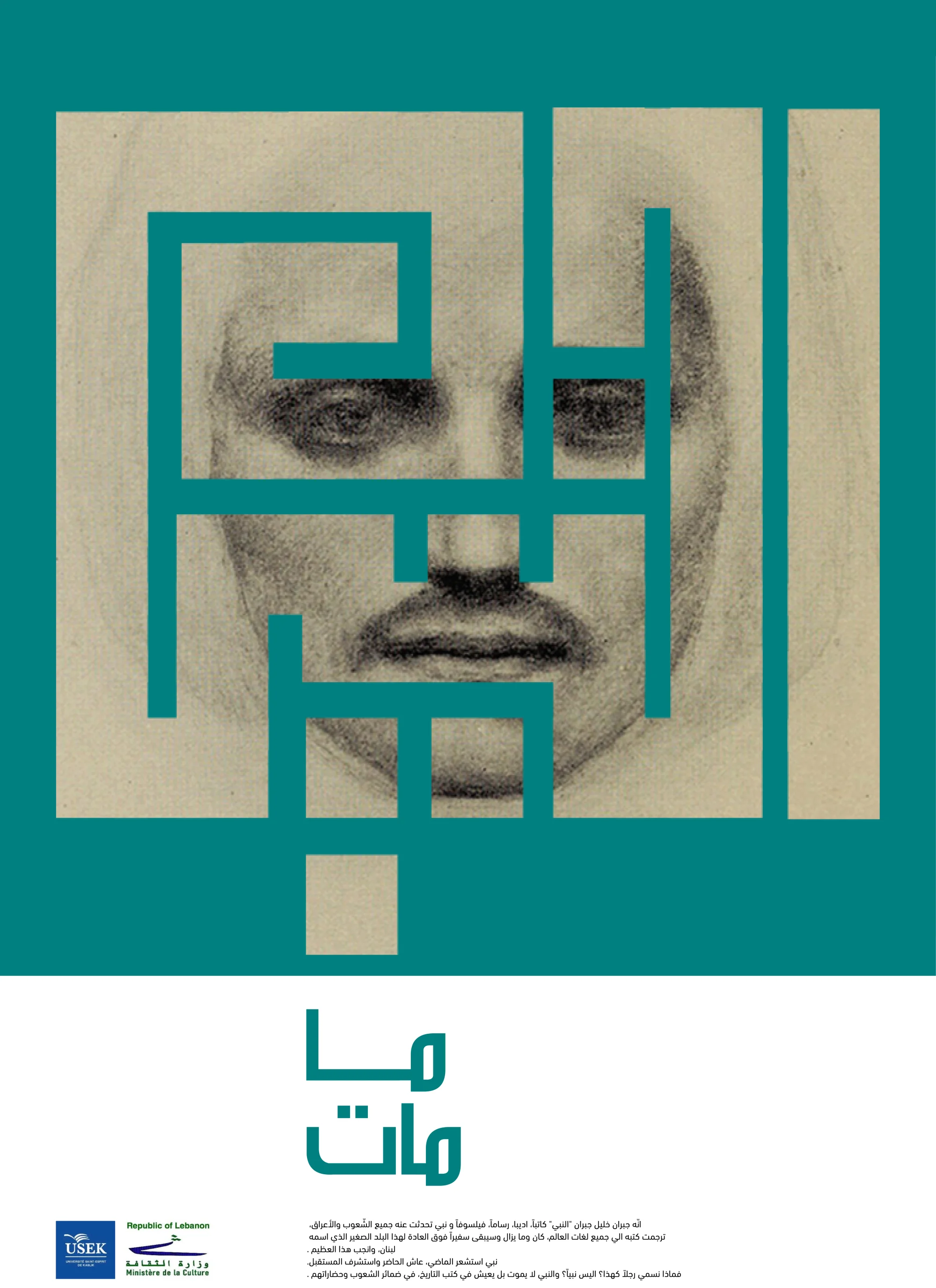
Ma Mat editorial poster, Arabic typography composed over a portrait

Concept

A portrait is the floor; the Arabic letterform is the wall. ما مات sits across the face as architecture, the counters of the script forming the negative volumes through which the eye reads the figure.

The whole poster is built from one weight, one ink, one alignment. Hierarchy comes from where the type breaks the portrait, not from scale change.

  • Display Arabic, single weight, full-bleed
  • Portrait integration via counter and stroke
  • Editorial format, single colour

06.2

La Cinquanta

Exhibition poster · School of Architecture & Design

La Cinquanta exhibition poster mounted on a wall mockup

Concept

Fifty years of a school deserves a mark, not a celebration. La Cinquanta is built around a single confident numeral that reads as a milestone before it reads as a date, and a typographic stack that keeps the rest of the page out of its way.

Shown in situ on a wall mockup: a poster sized to be read across a corridor, not in the hand.

  • Single‑numeral hero, set as object
  • Stacked typographic information block
  • Wall‑scale, corridor‑legible