Chapter 05
Duolingo, on the wrist
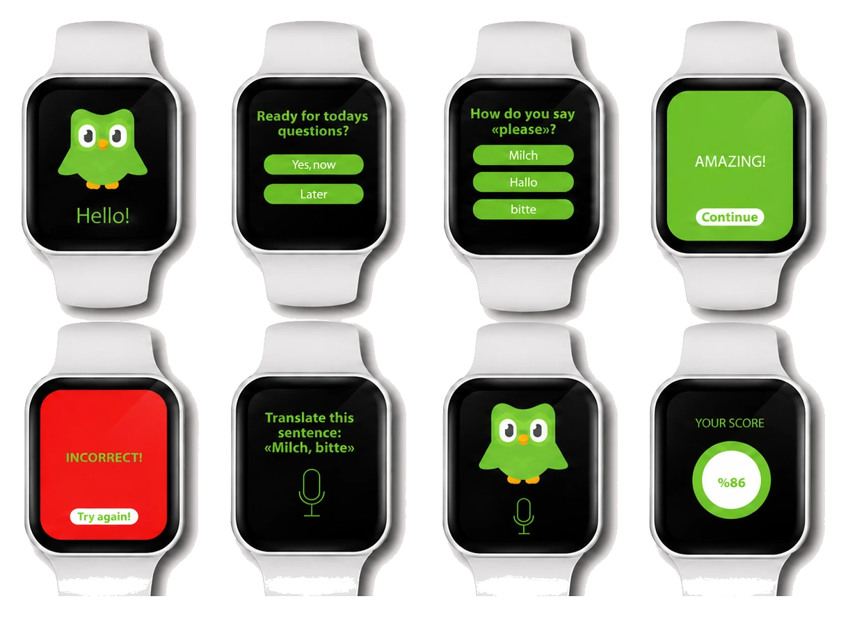
A reimagined Duolingo experience for Apple Watch. The brief: drop the app to its smallest meaningful unit, keep the feedback loop loud, and make the scoreline feel earned.
Concept
The watch is not a phone with a smaller screen; it is a different surface entirely. The wrist permits one thing at a time, read at a glance, dismissed in a tap.
So the flow is reduced to its smallest meaningful unit: a single prompt, a single answer, an unmistakable yes or no, and a streak that earns its own colour. No menus, no nesting, no settings the wrist will never want.
Feature spec
Five units, one wrist
-
01
Real‑time translation
Quick, on‑the‑go practice that does not ask the user to leave the wrist.
-
02
Colour feedback
Green when correct, red when not. The screen is the answer; no copy needed.
-
03
Streak nudges
Pop‑up reminders that keep the streak alive without breaking the day.
-
04
Multiple attempts
Repetition is the lesson. Each question allows several tries before it moves on.
-
05
Score, as a ring
A single ring carries the score. No leaderboard chrome, no pages of stats.